Standard:
-moz-border-radius: 10px;
-webkit-border-radius: 10px;
border-radius: 10px; /* future proofing */
-khtml-border-radius: 10px; /* for old Konqueror browsers */
Individual Corners:
-moz-border-radius-topleft: 10px;
-moz-border-radius-topright: 20px;
-moz-border-radius-bottomright: 30px;
-moz-border-radius-bottomleft: 0;

-webkit-border-top-left-radius: 10px;
-webkit-border-top-right-radius: 20px;
-webkit-border-bottom-right-radius: 30px;
-webkit-border-bottom-left-radius: 0;
Shorthand:
-moz-border-radius: [top-left] [top-right] [bottom-right] [bottom-left]
-moz-border-radius: 10px 20px 30px 0;Elliptical Rounding (Firefox 3.5+):
-moz-border-radius-topleft: [horizontal radius] [vertical radius];
-moz-border-radius-topleft: 10px 40px;Elliptical Rounding Shorthand (Firefox 3.5+):
-moz-border-radius: [horizontal radius] / [vertical radius];
-moz-border-radius: 10px / 40px;-moz-border-radius: 10px 20px 30px 40px / 15px 30px 45px 60px;
Above is the same as:
-moz-border-radius-topleft: 10px 15px;
-moz-border-radius-topright: 20px 30px;
-moz-border-radius-bottomright: 30px 45px;
-moz-border-radius-bottomleft: 40px 60px;
WebKit Elliptical Rounding
All corners:
-webkit-border-radius: 36px 12px;
Right corners only:
-webkit-border-top-right-radius: 50px 30px;
-webkit-border-bottom-right-radius: 50px 30px;
CSS: border-radius and -moz-border-radius
One of the most keenly-anticipated CSS3 properties isborder-radius. Web designers will no longer have to resort to complex table structures using custom-made corner graphics or including arcane JavaScript files in order to produce designs with rounded corners.
While Internet Explorer before IE9 doesn't support many (or any) advanced CSS properties, the Mozilla (Firefox and related browsers) and WebKit (Apple's web browser engine used in Safari and Chrome) and Opera have supported them for many years.
The vendor prefixes (-moz, -webkit) are now no longer necessary for the latest browser releases as they have all adopted the official CSS3 syntax.
1. Definition and syntax for border-radius
As with many CSS properties relating to margins, padding and borders, there are four individual properties - one for each corner of a box element - and one shorthand property. Each of the corner attributes will accept either one or two values. The border-radius property will accept up to two values in WebKit browsers and up to eight now in Firefox 3.5.
Here are the CSS and browser-specific attributes in question:
| CSS3 | Mozilla equivalent | WebKit equivalent |
|---|---|---|
| border-top-right-radius | -moz-border-radius-topright | -webkit-border-top-right-radius |
| border-bottom-right-radius | -moz-border-radius-bottomright | -webkit-border-bottom-right-radius |
| border-bottom-left-radius | -moz-border-radius-bottomleft | -webkit-border-bottom-left-radius |
| border-top-left-radius | -moz-border-radius-topleft | -webkit-border-top-left-radius |
| border-radius | -moz-border-radius | -webkit-border-radius |
Prior to IE9 these CSS3 properties do not work in Internet Explorer. The 'Mozilla' versions however work perfectly well in Firefox and other Mozilla-based browsers and the 'WebKit' ones in Safari and Chrome as well as the iPhone/iPad.
Each of the individual corner CSS3 properties take either one or two length values (generally 'px' or 'em' values). If a single value is supplied then that becomes the radius of a rounded corner. If two values are supplied then they become the horizontal and vertical radii for an elliptical corner.
The Mozilla syntax before Firefox 3.5 only supported round (as opposed to elliptical) corners and adding a second value would result in a standard square corner.
The border-radius property in WebKit accepts one or two values and uses them to style all four corners making a nice symmetric shape. The new Firefox syntax allows you to define four different round or elliptical corners. A slash has been introduced to separate the horizontal and vertical lengthsettings.
There is no pure-CSS solution for rounded corners in IE8 or other primitive browsers. Only a range of JavaScript patches which can be found by searching online.
2. Using -moz-border-radius in Mozilla (Firefox)
The following examples will only work if you're using Firefox or another Mozilla browser that supports-moz-border-radius properties.
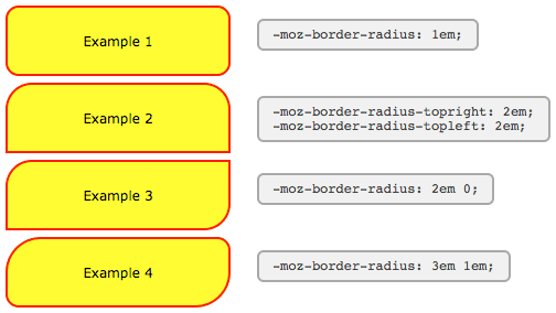
Example 1
-moz-border-radius: 1em;
Example 2
-moz-border-radius-topright: 2em;
-moz-border-radius-topleft: 2em;
Example 3
-moz-border-radius: 2em 0;
Example 4
-moz-border-radius: 3em 1em;
The Mozilla properties used here do not conform to the standard (hence the -moz- prefix) and until Firefox 3.5 only supported round corners. In newer versions of Firefox elliptical corners are also possible.
As some people have pointed out these properties can be used not just for 'boxes' but for many other HTML objects including form elements.
For those of you still seeing square corners, here's a snapshot from Firefox showing the rounded corners effect:
There are a number of tricky JavaScript solutions that allow border-radius and other CSS3 properties to be seen in Internet Explorer and other browsers - but the overheads don't really justify the results.
3. Using -webkit-border-radius in Safari (Webkit)
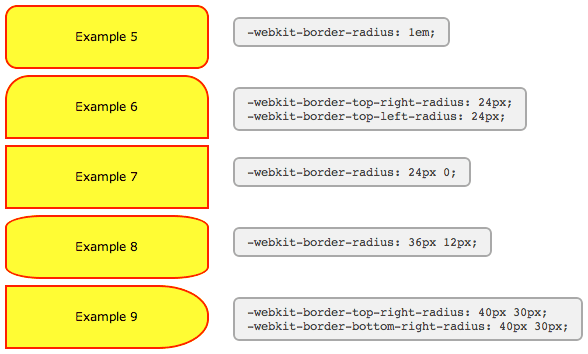
The latest versions of Safari now support -webkit-border-radius. Previously only the 'nightly builds' contained this functionality In Opera the syntax for the corners is the same as in Safari, but the behaviour of border-radius with two values matches that of Firefox, as seen in Example #7 below:
Example 5
-webkit-border-radius: 1em;
Example 6
-webkit-border-top-right-radius: 24px;
-webkit-border-top-left-radius: 24px;
Example 7
-webkit-border-radius: 24px 0;
Example 8
-webkit-border-radius: 36px 12px;
Example 9
-webkit-border-top-right-radius: 50px 30px;
-webkit-border-bottom-right-radius: 50px 30px;
For those of you still seeing square corners, below you can find asnapshot from WebKit showing the rounded corners effect. Note particularly the change in syntax and the effect of passing two values to-webkit-border-radius as compared to the -moz-border-radius example above.
WebKit also has limited support for other CSS3 border properties such as: multiple backgrounds; border background images; and various advanced selectors (::select for example) making it a great test platform for forward-looking developers. Stay tuned to the Surfin' Safari blog linked below for the latest exciting developments.
4. Other special effects
WebKit, Firefox and Opera now support a number of other CSS3 features, including the following simple effects and transforms. Thankfully, unlike rounded corners, for the shadows and transforms there does seem to be agreement on a common syntax.
-webkit-box-shadow
Shadow Example
-webkit-border-radius: 36px 12px;
-moz-border-radius: 36px / 12px;
-webkit-box-shadow: 2px 2px 6px rgba(0,0,0,0.6);
Clearly there are still some anti-aliasing problems, but for corners and gentle curves it can look pretty cool.
Then there are various -webkit-tranform option that can be used to create all kinds of wierd and wonderful shapes:
-webkit-transform: rotate()
Rotate Example
-webkit-border-radius: 36px 12px;
-moz-border-radius: 36px / 12px;
-webkit-transform: rotate(-5deg);
-webkit-transform: skew()
Skew Example
-webkit-border-radius: 36px 12px;
-moz-border-radius: 36px / 12px;
-webkit-transform: skew(5deg,5deg);
For the browser-impaired here is a screenshot from Safari showing the effect of these CSS rules. The same effects are now possible in Firefox, Opera and related browsers. Just replace -webkit with -mozor -o, except for border-radius and box-shadow where Opera uses no prefix.
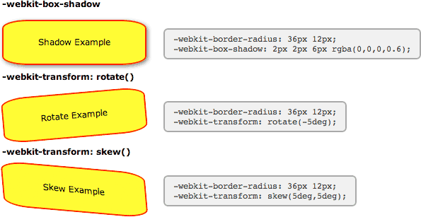
Also in Safari these and other transformations can be implemented as animations using just CSS effects triggered by hovering over an element - no JavaScript required.
5. New short-hand properties
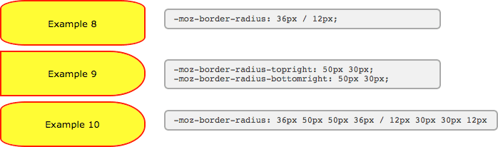
The following syntax is now working in Firefox and Opera allowing you to specify not only matching elliptical corners, but also different elliptical corners in one shorthand property.
Here we've recreated two of the WebKit examples above using the new syntax. You can see that the individual corner settings work exactly the same now in Firefox as in WebKit, but for the short-hand property you need to include a slash:
Example 8
-moz-border-radius: 36px / 12px;
border-radius: 36px / 12px;
Example 9
-moz-border-radius-topright: 50px 30px;
-moz-border-radius-bottomright: 50px 30px;
And now to the scary part. Using the short-hand property, all valued before the slash apply to the horizontal radii and all values afterwards to the vertical. In this example we've created a hybrid of the previous two examples.
Example 10
-moz-border-radius: 36px 50px 50px 36px / 12px 30px 30px 12px
border-radius: 36px 50px 50px 36px / 12px 30px 30px 12px
Here you can see what these boxes look like in Firefox 3.5:
With all major browsers now using the same syntax, the vendor-prefixes have been dropped and the standard seems to be set in stone.
কোন মন্তব্য নেই:
একটি মন্তব্য পোস্ট করুন